Animated Covid 19 analysis using Python

Using Plotly’s chloropeth graphs and generic python graphing to visualize Covid 19 infection and death rates and the impact of lockdown in various countries.

Covid 19 analysis using Python

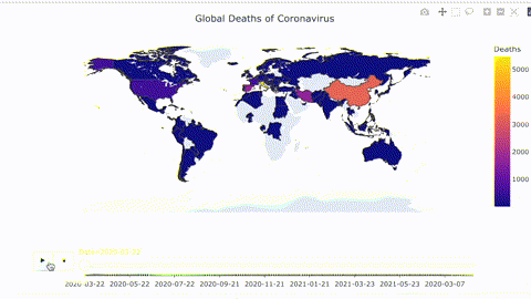
We use Python to animate the spread of covid around the world. Then we focus on a few countries and see how the impact of lockdown has affected the spread of covid in that country. We further see how the infection rates and death rates are correlated.


Importing modules

Task 1

import pandas as pd
import numpy as np
import plotly.express as px
import matplotlib.pyplot as plt 
print('modules are imported')
modules are imported

Task 1.1:

Loading the Dataset

dataset_url = 'https://raw.githubusercontent.com/datasets/covid-19/main/data/countries-aggregated.csv'
fname = 'data/countries-aggregated.csv'
df = pd.read_csv(fname)
df_31May21 = df[df.Date == '2020-05-31']
df_31May21.head()

DateCountryConfirmedRecoveredDeaths
1302020-05-31Afghanistan152081328258
6582020-05-31Albania113787233
11862020-05-31Algeria93945748653
17142020-05-31Andorra76469451
22422020-05-31Angola86184

Task 1.2:

let’s check the dataframe

df_31May21.head()

DateCountryConfirmedRecoveredDeaths
1302020-05-31Afghanistan152081328258
6582020-05-31Albania113787233
11862020-05-31Algeria93945748653
17142020-05-31Andorra76469451
22422020-05-31Angola86184
df_31May21.tail()

DateCountryConfirmedRecoveredDeaths
1004502020-05-31Vietnam3282790
1009782020-05-31West Bank and Gaza4483723
1015062020-05-31Yemen3231480
1020342020-05-31Zambia10577797
1025622020-05-31Zimbabwe178294

let’s check the shape of the dataframe

df_31May21.shape
(195, 5)
df.shape
(102960, 5)

Task 2.1 :

let’s do some preprocessing

dfconf=df[df.Confirmed>0]
dfconf.head()

DateCountryConfirmedRecoveredDeaths
332020-02-24Afghanistan100
342020-02-25Afghanistan100
352020-02-26Afghanistan100
362020-02-27Afghanistan100
372020-02-28Afghanistan100
dfconf.shape
(91970, 5)
dfconf[dfconf.Country=='Italy'].head(10)

DateCountryConfirmedRecoveredDeaths
448892020-01-31Italy200
448902020-02-01Italy200
448912020-02-02Italy200
448922020-02-03Italy200
448932020-02-04Italy200
448942020-02-05Italy200
448952020-02-06Italy200
448962020-02-07Italy300
448972020-02-08Italy300
448982020-02-09Italy300

let’s see Global spread of Covid19

Code:

fig = px.choropleth(dfconf, locations='Country', locationmode='country names', color='Confirmed', animation_frame='Date')
fig.layout.updatemenus[0].buttons[0].args[1]['frame']['duration'] = 30
fig.layout.updatemenus[0].buttons[0].args[1]['transition']['duration'] = 5
fig.update_geos(projection_type="equirectangular", visible=True, resolution=50)
fig.update_layout(
    title_text = 'Global Spread of Coronavirus',
    title_x = 0.5,
    geo=dict(
        showframe = False,
        showcoastlines = False,
    ))
#fig.show()
iplot(fig,show_link=False)
pio.write_json(fig,"file001.json",engine="json")
fig.write_html("plot001.html")

Chart 1: Global Spread of Covid over Time

spread of covid
Spread of Covid

Example of Infection rate in China:

Chart 2:

Apr 2020Jul 2020Oct 2020Jan 2021Apr 2021Jul 2021020k40k60k80k100k
variableConfirmedInfection RateDatevalue
---

let’s see Global spread of Covid19

title: Chk Part 02

Let’s see Global deaths of Covid19

dfdeaths=df[df.Deaths>0]
dfdeaths.head()

DateCountryConfirmedRecoveredDeaths
602020-03-22Afghanistan3411
612020-03-23Afghanistan4111
622020-03-24Afghanistan4311
632020-03-25Afghanistan7622
642020-03-26Afghanistan8023
dfdeaths.shape
(81987, 5)

Chart 2: Global Deaths from Covid

Global Deaths from Covid
title: Chk Part 03

Let’s Visualize how intensive the Covid19 Transmission has been in each of the country

let’s start with an example:

df_china=df[df.Country == 'China']
import pandas as pd
import numpy as np
import plotly.express as px
import matplotlib.pyplot as plt 
print('modules are imported')
modules are imported
df_china.head()

DateCountryConfirmedRecoveredDeaths
190082020-01-22China5482817
190092020-01-23China6433018
190102020-01-24China9203626
190112020-01-25China14063942
190122020-01-26China20754956

let’s select the columns that we need

df_china=df_china[['Date','Confirmed']]
df_china.head()

DateConfirmed
190082020-01-22548
190092020-01-23643
190102020-01-24920
190112020-01-251406
190122020-01-262075

calculating the first derivation of confrimed column

df_china['Infection Rate']=df_china['Confirmed'].diff()
df_china.head()

DateConfirmedInfection Rate
190082020-01-22548NaN
190092020-01-2364395.0
190102020-01-24920277.0
190112020-01-251406486.0
190122020-01-262075669.0
#px.line(df_china, x='Date', y=['Confirmed', 'Infection Rate'])

df_china['Infection Rate'].max()
15136.0

Task 3.2:

Let’s Calculate Maximum infection rate for all of the countries

df.head()

DateCountryConfirmedRecoveredDeaths
02020-01-22Afghanistan000
12020-01-23Afghanistan000
22020-01-24Afghanistan000
32020-01-25Afghanistan000
42020-01-26Afghanistan000
countries=list(df['Country'].unique())
#countries
countries=list(df['Country'].unique())


max_infection_rate=[]
for c in countries :
    MIR = df[df.Country == c].Confirmed.diff().max()
    max_infection_rate.append(MIR)
#print(max_infection_rate)


Task 3.3:

let’s create a new Dataframe

df_MIR=pd.DataFrame()
df_MIR['Country'] = countries
df_MIR['Max Infection Rate'] = max_infection_rate
df_MIR.head()

CountryMax Infection Rate
0Afghanistan5168.0
1Albania1239.0
2Algeria1133.0
3Andorra299.0
4Angola405.0

Let’s plot the barchart : maximum infection rate of each country

#px.bar(df_MIR, x='Country', y='Max Infection Rate', color='Country', title='global maximum infection rate', log_y=True) 
#log to increase the quALITY FOR low bars - changes scale for y axis

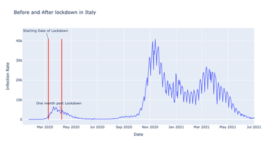
Task 4: Let’s See how National Lockdowns Impacts Covid19 transmission in Italy

COVID19 pandemic lockdown in Italy

On 9 March 2020, the government of Italy under Prime Minister Giuseppe Conte imposed a national quarantine, restricting the movement of the population except for necessity, work, and health circumstances, in response to the growing pandemic of COVID-19 in the country. source

italy_lockdown_start_date = '2020-03-09'
italy_lockdown_a_month_later = '2020-04-09'
df.head()

DateCountryConfirmedRecoveredDeaths
02020-01-22Afghanistan000
12020-01-23Afghanistan000
22020-01-24Afghanistan000
32020-01-25Afghanistan000
42020-01-26Afghanistan000

let’s get data related to italy

df_italy=df[df.Country=='Italy']

lets check the dataframe

df_italy.head()

DateCountryConfirmedRecoveredDeaths
448802020-01-22Italy000
448812020-01-23Italy000
448822020-01-24Italy000
448832020-01-25Italy000
448842020-01-26Italy000

let’s calculate the infection rate in Italy

df_italy['Infection Rate']=df_italy.Confirmed.diff()
df_italy.head()
/var/folders/43/4nqhk6qx3kxcwf85q5ncg9lm0000gn/T/ipykernel_74583/3001688291.py:1: SettingWithCopyWarning:


A value is trying to be set on a copy of a slice from a DataFrame.
Try using .loc[row_indexer,col_indexer] = value instead

See the caveats in the documentation: https://pandas.pydata.org/pandas-docs/stable/user_guide/indexing.html#returning-a-view-versus-a-copy

DateCountryConfirmedRecoveredDeathsInfection Rate
448802020-01-22Italy000NaN
448812020-01-23Italy0000.0
448822020-01-24Italy0000.0
448832020-01-25Italy0000.0
448842020-01-26Italy0000.0

ok! now let’s do the visualization

FigIt=px.line(df_italy, x='Date', y='Infection Rate', title="Before and After lockdown in Italy")
FigIt.show()
FigIt2=px.line(df_italy, x='Date', y='Infection Rate', title="Before and After lockdown in Italy")
FigIt2.add_shape(
    dict(
        type="line",
        x0=italy_lockdown_start_date,
        y0=0,
        x1=italy_lockdown_start_date,
        y1=df_italy['Infection Rate'].max(),
        line=dict(color='red', width=2)

    )
)
FigIt2.add_annotation(
    dict(
        x=italy_lockdown_start_date,
        y=df_italy['Infection Rate'].max(),
        text='Starting Date of Lockdown'
    )
)
FigIt2.show()
FigIt3=px.line(df_italy, x='Date', y='Infection Rate', title="Before and After lockdown in Italy")
FigIt3.add_shape(
    dict(
        type="line",
        x0=italy_lockdown_start_date,
        y0=0,
        x1=italy_lockdown_start_date,
        y1=df_italy['Infection Rate'].max(),
        line=dict(color='red', width=2)

    )
)
FigIt3.add_annotation(
    dict(
        x=italy_lockdown_start_date,
        y=df_italy['Infection Rate'].max(),
        text='Starting Date of Lockdown'
    )
)

FigIt3.add_shape(
    dict(
        type="line",
        x0=italy_lockdown_a_month_later,
        y0=0,
        x1=italy_lockdown_a_month_later,
        y1=df_italy['Infection Rate'].max(),
        line=dict(color='red', width=2)

    )
)
FigIt3.add_annotation(
    dict(
        x=italy_lockdown_a_month_later,
        y=4000,
        text='One month post Lockdown'
    )
)

FigIt3.show()
---------------------------------------------------------------------------
FigIt2=px.line(df_italy, x='Date', y='Infection Rate', title="Before and After lockdown in Italy")
FigIt2.add_shape(
    dict(
        type="line",
        x0=italy_lockdown_start_date,
        y0=0,
        x1=italy_lockdown_start_date,
        y1=df_italy['Infection Rate'].max(),
        line=dict(color='red', width=2)

    )
)
FigIt2.add_annotation(
    dict(
        x=italy_lockdown_start_date,
        y=df_italy['Infection Rate'].max(),
        text='Starting Date of Lockdown'
    )
)
FigIt2.show()
---------------------------------------------------------------------------
FigIt3=px.line(df_italy, x='Date', y='Infection Rate', title="Before and After lockdown in Italy")
FigIt3.add_shape(
    dict(
        type="line",
        x0=italy_lockdown_start_date,
        y0=0,
        x1=italy_lockdown_start_date,
        y1=df_italy['Infection Rate'].max(),
        line=dict(color='red', width=2)

    )
)
FigIt3.add_annotation(
    dict(
        x=italy_lockdown_start_date,
        y=df_italy['Infection Rate'].max(),
        text='Starting Date of Lockdown'
    )
)

FigIt3.add_shape(
    dict(
        type="line",
        x0=italy_lockdown_a_month_later,
        y0=0,
        x1=italy_lockdown_a_month_later,
        y1=df_italy['Infection Rate'].max(),
        line=dict(color='red', width=2)

    )
)
FigIt3.add_annotation(
    dict(
        x=italy_lockdown_a_month_later,
        y=4000,
        text='One month post Lockdown'
    )
)

FigIt3.show()
---------------------------------------------------------------------------

Before and After Lockdown

Task 5: Let’s See how National Lockdowns Impacts Covid19 active cases in Italy

df_italy.head()

DateCountryConfirmedRecoveredDeathsInfection Rate
448802020-01-22Italy000NaN
448812020-01-23Italy0000.0
448822020-01-24Italy0000.0
448832020-01-25Italy0000.0
448842020-01-26Italy0000.0

let’s calculate number of active cases day by day

df_italy['Death Rate']=df_italy.Deaths.diff()
/var/folders/43/4nqhk6qx3kxcwf85q5ncg9lm0000gn/T/ipykernel_74583/834131105.py:1: SettingWithCopyWarning:


A value is trying to be set on a copy of a slice from a DataFrame.
Try using .loc[row_indexer,col_indexer] = value instead

See the caveats in the documentation: https://pandas.pydata.org/pandas-docs/stable/user_guide/indexing.html#returning-a-view-versus-a-copy

let’s check the dataframe again

df_italy.head()

DateCountryConfirmedRecoveredDeathsInfection RateDeath Rate
448802020-01-22Italy000NaNNaN
448812020-01-23Italy0000.00.0
448822020-01-24Italy0000.00.0
448832020-01-25Italy0000.00.0
448842020-01-26Italy0000.00.0

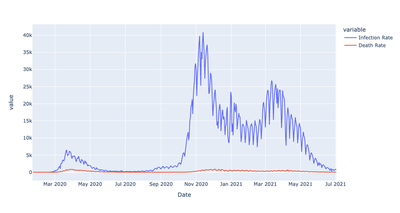
now let’s plot a line chart to compare COVID19 national lockdowns impacts on spread of the virus and number of active cases

figit4=px.line(df_italy, x='Date', y=['Infection Rate', 'Death Rate'])
figit4.show()
---------------------------------------------------------------------------

Absolute Death Rates and Infection Rates Before and After Lockdown - scaling issue
Absolute Death Rates and Infection Rates Before and After Lockdown - not easily comparable

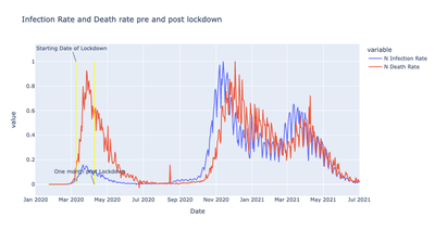
df_italy['N Infection Rate']=df_italy['Infection Rate']/df_italy['Infection Rate'].max()
df_italy['N Death Rate']=df_italy['Death Rate']/df_italy['Death Rate'].max()

/var/folders/43/4nqhk6qx3kxcwf85q5ncg9lm0000gn/T/ipykernel_74583/3675118474.py:1: SettingWithCopyWarning:


A value is trying to be set on a copy of a slice from a DataFrame.
Try using .loc[row_indexer,col_indexer] = value instead

See the caveats in the documentation: https://pandas.pydata.org/pandas-docs/stable/user_guide/indexing.html#returning-a-view-versus-a-copy

/var/folders/43/4nqhk6qx3kxcwf85q5ncg9lm0000gn/T/ipykernel_74583/3675118474.py:2: SettingWithCopyWarning:


A value is trying to be set on a copy of a slice from a DataFrame.
Try using .loc[row_indexer,col_indexer] = value instead

See the caveats in the documentation: https://pandas.pydata.org/pandas-docs/stable/user_guide/indexing.html#returning-a-view-versus-a-copy
figf= px.line(df_italy, x='Date', y=['N Infection Rate', 'N Death Rate'])
figf.show()
---------------------------------------------------------------------------
figf1= px.line(df_italy, x='Date', y=['N Infection Rate', 'N Death Rate'], title="Infection Rate and Death rate pre and post lockdown")

figf1.add_shape(
    dict(
        type="line",
        x0=italy_lockdown_start_date,
        y0=0,
        x1=italy_lockdown_start_date,
        y1=df_italy['N Infection Rate'].max(),
        line=dict(color='yellow', width=2)

    )
)
figf1.add_annotation(
    dict(
        x=italy_lockdown_start_date,
        y=df_italy['N Infection Rate'].max(),
        text='Starting Date of Lockdown'
    )
)

figf1.add_shape(
    dict(
        type="line",
        x0=italy_lockdown_a_month_later,
        y0=0,
        x1=italy_lockdown_a_month_later,
        y1=df_italy['N Infection Rate'].max(),
        line=dict(color='yellow', width=2)

    )
)
figf1.add_annotation(
    dict(
        x=italy_lockdown_a_month_later,
        y=0,
        text='One month post Lockdown'
    )
)

figf1.show()
---------------------------------------------------------------------------

Relative Infection Rates and Death Rates Before and After Lockdown


Saif Sayeed Syed
Saif Sayeed Syed
MSc Dental Public Health

My research interests include aspects of universal health coverage, health systems, health promotion and health inequalities with a focus at oral health and sugar